New Naturopathica—sustainable inside and out
Rebranding and relaunching Naturopathica’s skin and beauty products
Rebranding and relaunching Naturopathica’s skin and beauty products
Naturopathica—founded in 1995 and based in East Hampton, New York—reached out to Elixir to rebrand itself with a relaunch of its skin and beauty products. At that time, the line was carried by select high profile spas around the country and sold direct online. Naturopathica enjoyed a small loyal following but was frustrated by a fiercely competitive marketplace brimming with false claims. Barbara Close, Founder and CEO, knew the brand was flying under the radar and suspected that the packaging’s home-grown look and misperceptions about the performance of botanical skin care were factors that needed to be addressed.
As part of our North Star process, Elixir conducted 1-on-1 interviews with current & prospective customers and spa partners to help Naturopathica understand how their brand was perceived. The findings illuminated the gap between current perceptions and desired positioning, inspiring the company to undertake a comprehensive retooling of everything from product to packaging. The company reformulated many of it’s products—replete with sustainable, certified-organic and wildcrafted ingredients—to earn ECOCERT certification, while Elixir developed the elevator pitch and redesign of Naturopathica’s brand visual language—including identity, business system, style guide and packaging for nearly 100 products.
Barbara Close sums up her Elixir experience to date:
“We have worked with various design and branding firms over the years. When I reviewed Elixir’s portfolio, I felt there was great attention to detail and adherence to simplicity, both very important for Naturopathica.
Elixir put us front and center. Everyone on the team was an excellent listener, so we felt really ‘met.’ They understood our lineage of apothecary and the challenge of honoring our roots and telling our story in an interesting visual way. Elixir’s North Star process helped us unearth our gems and bring them out into our materials. They were great at helping us get to an unexpected place, what I call ‘the aha factor.’ The whole process has been very exciting.”
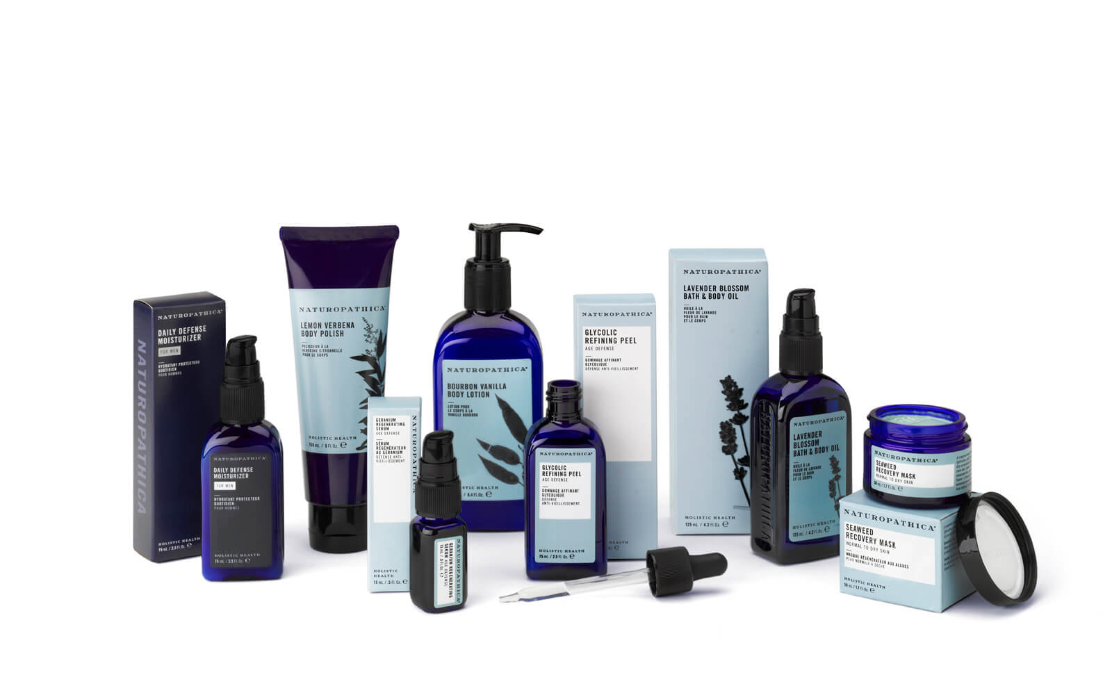
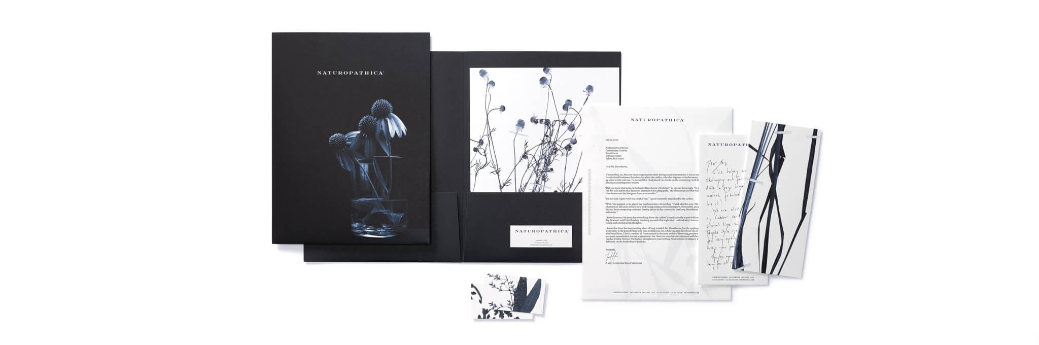
Elixir designed three custom bottle shapes with emboss of Naturopathica’s logotype. A custom color was applied to the remaining off-the-shelf containers providing consistency across 48 retail skus.
All collateral and packaging is made from 100% recycled fibers with a minimum of 35% post-consumer material.
Look for it online at at www.naturopathica.com and at the finest holistic spas (in San Francisco at Therapeia and Studio C Skincare; in Sausalito at Cavallo Point; in Berkeley at Claremont Resort & Spa).
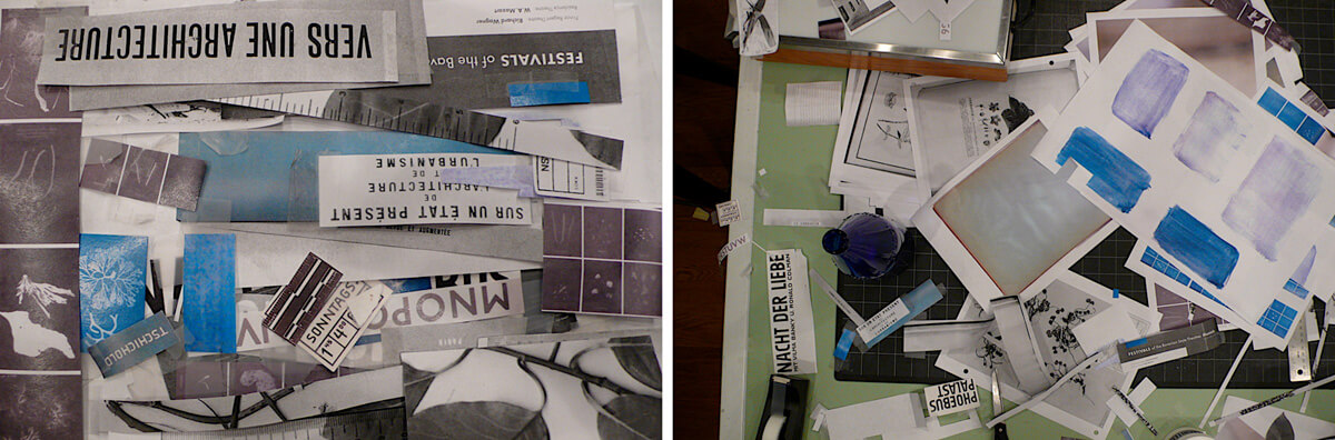
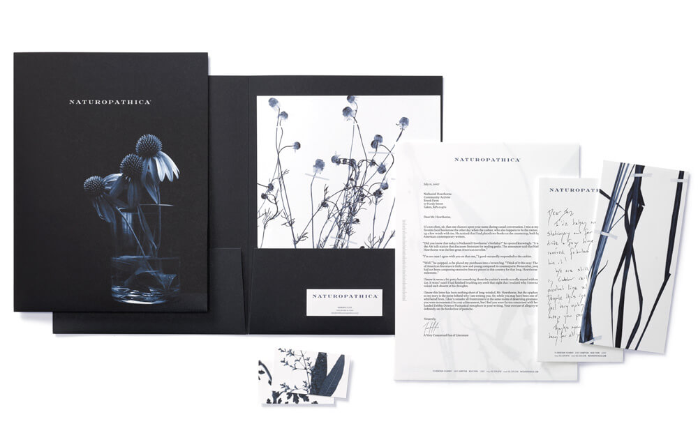
Details post-comping for an early presentation of look & feel referencing the vintage typography and palette of ‘apothecary.’
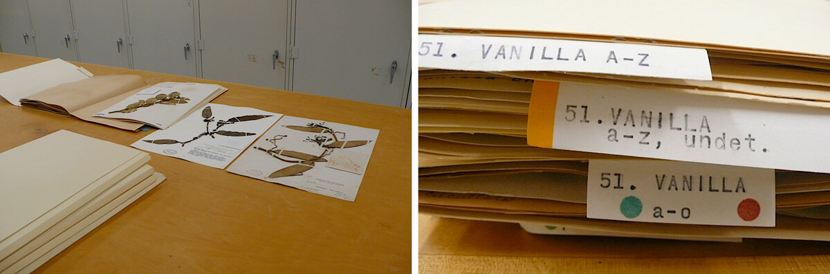
Botanical images were sourced specifically by species and region from the University and Jepson Herbaria at the University of California, Berkeley.