Commissioning a Logo Design? 6 Tips for the Process
Recommendations from 25 Years of Making Brand Identities
Recommendations from 25 Years of Making Brand Identities
Rolling out a new logo* is a big deal, whether it’s brand-new or the refresh of an existing one. A logo is a compact graphic, forever synonymous with your brand. Humans remember what they see more than what they read or hear, so that little encapsulation of your company should work hard to be indelible.
At Elixir, we’ve been doing precisely this kind of work—for start-ups and existing brands—for a very long time across countless industries, for-profits, and nonprofits.
If you are about to embark on a logo project, here are things to consider about the process and to address in the creative brief:
Sometimes a logo has an obvious formal or functional problem and warrants a change. But in many instances, it pays to ask: if nothing is broken and things are going well, why do you need a new logo? We’ve all been on the other side of a known or beloved brand changing theirs. It is often annoying and confusing. At Elixir, we advocate changing logos if it is accompanied by a substantial or material change to your offering, not because there is a new head of marketing or new CEO. This would be part of a “rebranding” effort. And by that, we mean a major initiative to reshape people’s perception of your brand.
Of course, it’s understandable that startups want and need a logo right away. The iterative process that works so beautifully for web and UX design is perfect for startups too. When a logo is designed for a startup, view it as a placeholder and expect to redo it when the organization better understands its offer, has its leadership team in place and the dust is largely settled. If you got it right on the first try, consider it a miracle.
A logo cannot possibly say it all, but it can, and should be, grounded in the truth about the endeavor it represents. The best logo designs are original, timeless, and memorable because they are indelibly appropriate for the brand they represent. It’s as if they were marinated in the secret sauce. Arm the design team with your secret sauce. Trust us, a good design team will not want to proceed without it.
There are schools of thought that say good logos should tell us something that is not obvious in the name. Often what the logo “tells you” is not literal, but intuitive—be it stylistically evoking solidity, community, warmth, or whatever. Your subconscious is a lot more receptive to nuance than you think. Ask your designer to talk to you about why she chose a particular font and hope the answer isn’t “because it is very popular right now.”
A pervasive request from clients is to design the logo and brand guidelines first. While it makes perfect sense in theory, this is never a good idea. Logo projects should accompany an overall brand identity assignment. Everything the logo lives with—the messaging which will be conveyed in typography, the images, the colors, the navigation, the infographics—are all best evolved holistically. Together, they can better convey the story of a brand.
A company’s visual language needs are best developed as a system. However, if this is not possible, then working on the new logo in tandem with one rich defining piece of visual communication for the brand, like a brochure or website, for instance, will aid in creating an effective solution.
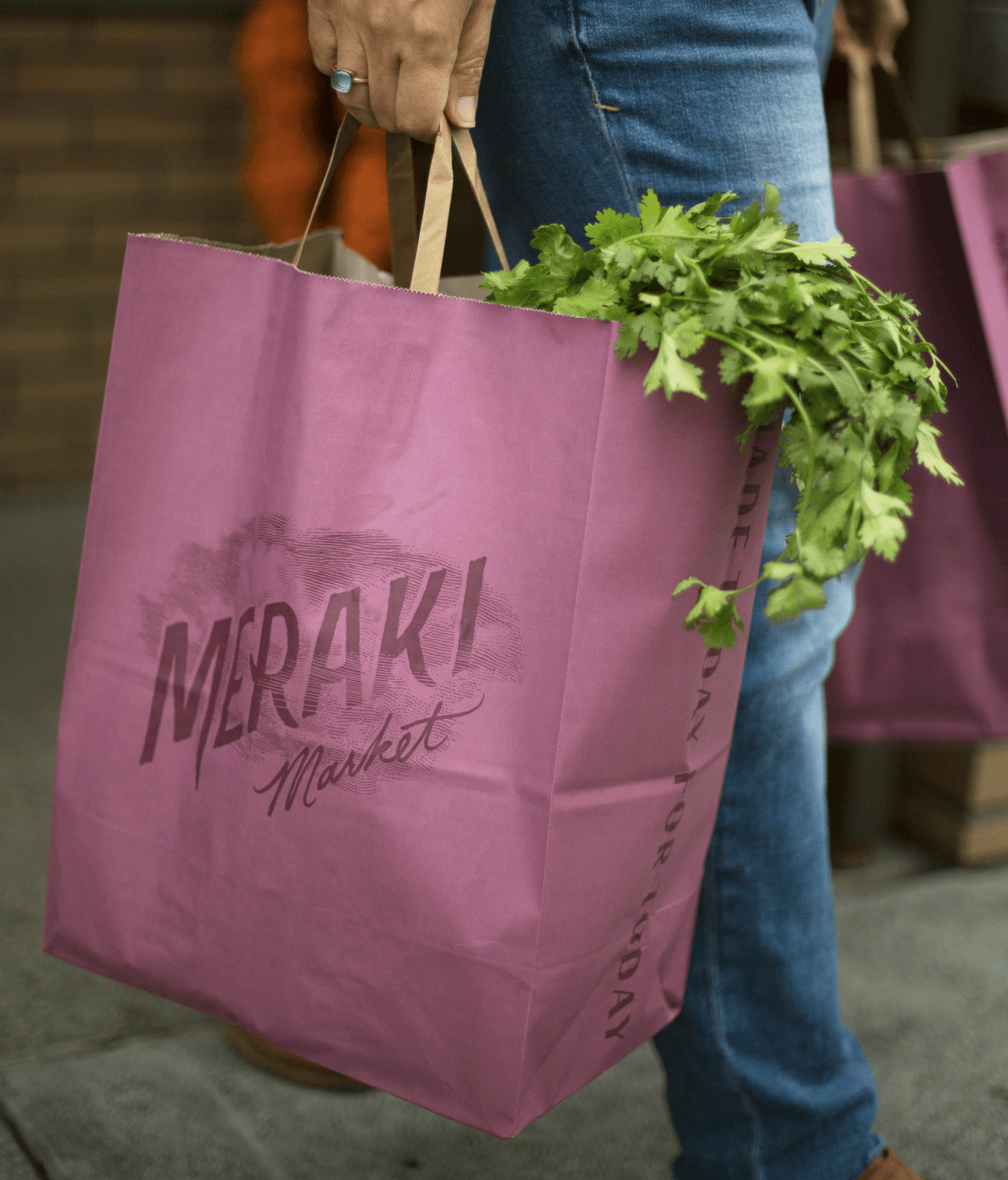
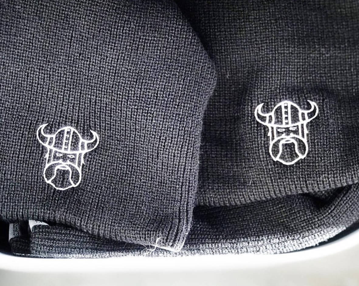
Think about all of the scenarios where your logo will ultimately live. On a business card and on a website, sure. But don’t overlook drilling down a few layers deeper. On a building? Over a photo? Embroidered on a hat? On the side of a tiny bottle?
Rank your use cases in order of importance. If you own a moving company, the side of the truck and apparel are where your logo needs to shine. If you own a skincare line, it will live most on cylindrical containers. If you own a bakery, it might be signage and a coffee cup. If it’s a spa, embroidery on a robe might be something to consider. You want it to shine bright where it will be most relevant to your audience.
If a logo is needed to work on top of photography (i.e. in a catalog or print ads) the designer needs to know this as it requires extra planning for this application to work successfully. Will it sit primarily on a navigation bar of a website? Can it operate effectively under tight spatial constraints? This is the type of context that the designer will need to make the best and most hardworking logo for you. And now with the advent and importance of social media channels, logos need to work harder than ever in many more environments.
After you determine the most important applications of your logo, you’ll want to ensure that in the design process, you actually evaluate the design directions in these scenarios. It’s not a good idea to solely evaluate logo directions presented in the middle of a white field. You need enough real context around each to understand how it’s working in relation to photography, large messaging, or in very small spaces. We usually subject design directions at varying scales in at least the top 3 use cases.
When it comes to the design of a logo, the most significant cost implications revolve around color. In the digital space, you can have as many colors as you like without repercussions to your bottom line. But print even two colors on a year’s worth of paper napkins and you may find that second color eating away your profit. Your designer may not be thinking about this. Sometimes, throwing caution to the wind is appropriate. Ten years ago, Jen was in the restaurant of a 5-star ski resort where the paper napkins were done in 4 colors and we are still talking about them to this day.
Having an illustrative logo with important details may also have cost implications when it comes to embroidery, signage, or other applications. It could require more time and testing in the fabrication phase to get it to reproduce accurately. But again, it could ultimately be worth it and stand apart from competitors for this very reason.
In design school they teach that a good logo should work in black and white only, meaning color shouldn’t be needed. It’s not that this rule can’t be broken, especially in this day and age, but you will most likely encounter the practical need for a black and white version of your logo, and it’ll save you money.
Ideally, there are at least three rounds of collaboration between client and designer. You will be amazed at the progression of design after feedback rounds. If you are not seeing something you like at the first pass, focus on what you do like, what is working, and it will move the momentum in that direction for the next round. While it can be incredibly fun to talk about what you don’t like, it is in your best interest to at least begin with what you do like. The chances are good that a lot of time has gone into preparing the work you are seeing. (A lot of it is in the wastebasket.) If you first speak to what you are interested in or excited about, the design will end up in a far better place than if you lead with what you don’t like. While we designers have spent years in critiques and critiquing one another, our ears work better once a positive direction emerges.
Know too, that once you have landed a “final” logo, just making all the file formats and guidelines about its use can take many hours. Rushing this process could create unnecessary problems.
A last word on commissioning this type of project; there are a lot of ways to get a logo or logotype done. There are paths that involve simply picking a font and typing out a word. There are people who are going to start with a font, customize it, or draw from scratch with a custom mark as well. There’s also the crowdsource route. Heck, there are logo generators on the internet that will spit one out for you for free. Kind of like eating; you can microwave a burrito, or prepare a home-cooked organic meal that involves ingredients harvested from your own yard. Your choice will be reflected in the price tag and the timeline. There’s no doubt you will get what you pay for. So what’s your appetite?
*The words logo and logotype are often used interchangeably. There is no right and wrong here but it may create some confusion between client and designer. We refer to typographic marks (letters that spell your name) as logotypes and refer to the symbol / image / icon / mark / chop, as logos. For readability, in this article, we will refer to both simply as logos.