LOGOTYPE
The logotype is drawn by hand and designed to look three-dimensional, evoking the quality of vintage signage.


The logotype is drawn by hand and designed to look three-dimensional, evoking the quality of vintage signage.


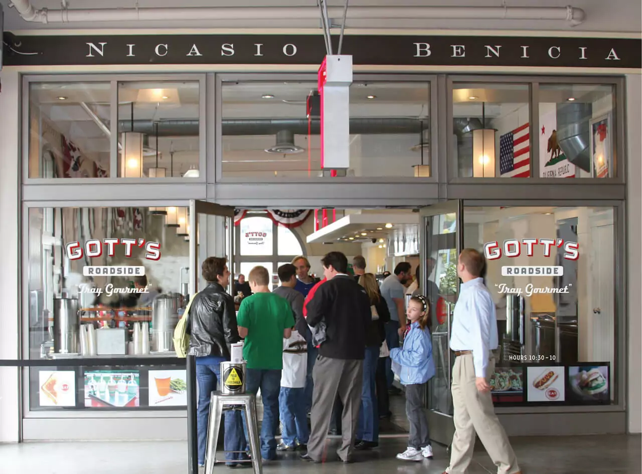
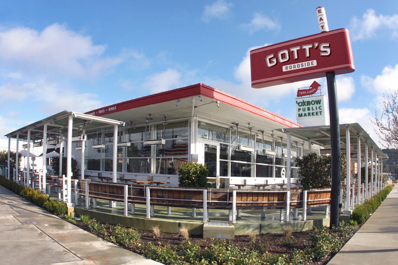
All three locations have a certain retro quality, and each projects its own vibe. Joel and Duncan Gott opened their original St. Helena location in 1999. In 2004, they opened a second location, in San Francisco’s gourmet mecca, the Ferry Building Marketplace. In 2008, Gott’s opened at Napa’s Oxbow Public Market. We wanted to play up the no-frills aesthetic and amplify its utilitarian hipness.


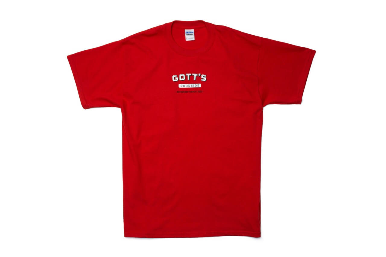
T-shirts, a major part of the brand, are limited-edition collectibles.



Inspired by vintage menus, which often included a personal letter from the owners, we stapled on a note directly from the Gotts, confirming that the place is completely unchanged. We contributed one special menu offering, a happy meal for $19.

Much of the exterior signage – such as “Open” and “Closed” – was hand painted onto Gott’s signature silver trays by New Bohemia Signs in San Francisco. We did a photo shoot to make the food look like vintage half-tones from the 1950s.


