
Logotype sketches, ideas for a photographic approach, fit icon concepts, typographic feel, and broad foundational inspirations fill Elixir’s process book for the Athleta brand.
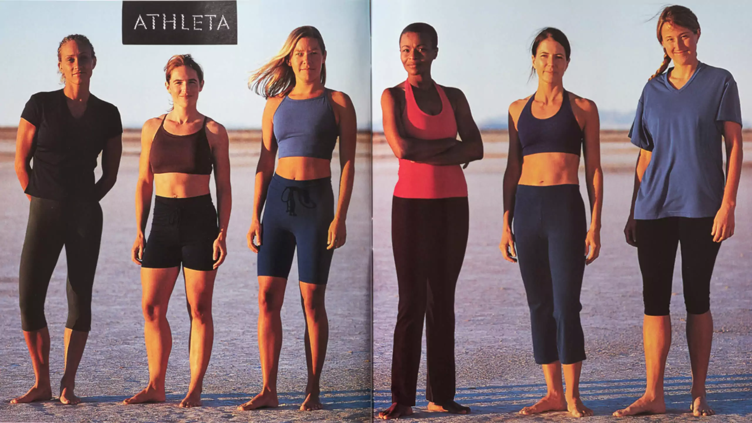


Up until the mid 90s, women’s athletic apparel often consisted of unisex sweats. Unisex = designs for men. An athletic woman wore the same thing as her boyfriend or husband. It’s hard to wrap one’s head around the idea that the category did not exist. Female athletes were also rarely portrayed. There was very little photography to be found. The limited inspirational shots we managed to find aided in showing the concept to investors in a mockup catalog (above).

Elixir and the photography teams sought to capture real female athletes in their element—with sweat, emotion, and grit. Due to low budgets and the desire for authenticity, rarely were professional models employed. The team engaged athletes we knew—friends, friends of friends, sisters, Athleta employees, and even Holly from Elixir (pictured above in the second catalog issue from 1999).


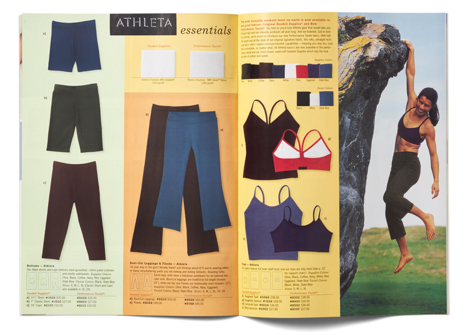
At first Athleta bought from other fledgling brands who were just beginning to create product for this market, as well as a few established brands. But eventually, the brand started to also create its own private label goods, starting with the Essentials line.
The initial vision was to provide well designed athletic apparel and gear for avid female athletes focused on specific sports. But what emerged through our North Star Process was a demand for comfortable and stylish apparel that performed just as well on the mountain as at the local café sipping lattes. The opportunity was to create a brand that forged a new category, one that eventually became known as “athleisure”.


Minimizing returns is always a challenge for retail catalogs. Seeing as budgets in Athleta’s first few years wouldn’t allow for every item of apparel to be depicted on a model, to aid in understanding cut, shape, and looseness vs. tightness, fit icons were meticulously created for every garment in the catalog. Additionally, rather than using the common practice of printing flat color to show garment colorways, cut fabric swatches for each item were photographed near 1:1 scale, so texture and finish could also be better understood.

Great customer service was paramount at the company from the outset. This included a 24-hour call center with a team of knowledgeable female athletes, as well as feedback cards sent out with every order.

With market research, creative direction, pre-merchandising, pagination, layout and design, location scouting, studio and lifestyle photography, copywriting, and print supervision, the catalog process requires extensive strategy, planning, and collaboration. It’s had a huge impact on how we approach design and branding at Elixir, and has helped shape many wonderful relationships, partnerships, and friendships.


